Borrowdale Rock Photography

Introduction
The long, often blue sky days of summer are a photographically challenging time but this year I wanted to make the most of them by doing something different and pushing my photography into an area not previously explored. My photographs are typically of the classic landscape / grand vista style and include land, sky and if possible, water. I needed a project concentrating on much smaller, simpler subjects that would, hopefully, lend themselves to summer conditions.
Please see the gallery at the bottom of this post for the full collection of photographs. Each may be enlarged by its selection.
After much deliberation two ideas remained. The use of colour, patterns, shapes and textures as a primary subject with images bias towards simplicity and the second idea was to photograph people rock climbing. I like the idea of photographing people in seemingly gravity defying positions high above the ground surrounded by hard unforgiving rock. There is a certain sense of tension and of drama.
At some point I realised that photographing climbers was going to be hard, very hard in fact, despite having over a decade of climbing experience myself but the idea of rock somehow stuck and fused with the first idea. So I had a project, but where to go?
Location
The English Lake District has a long history of rock climbing but also of quarrying for stone. That is no different from many other areas of the UK such as Snowdonia but I hadn’t been to the ‘lakes’ for a few years and felt it was time for another visit. Borrowdale is my favourite Lake District valley. It's a wide crescent shape with Keswick at the top and Seatoller at the bottom. It's green and a beautiful mix of small farms, trees and water surrounded by hills and sheep. And, of course, no description of Borrowdale can omit the magnificent Castle Crag which sits in the middle of the valley just below the Southern end of Derwent water. Seen from the North its imposing shape can't be mistaken. Borrowdale also makes a great location as it has the friendly campsite of Hollows Farm at Grange. This nestles just below the Northern slopes of Castle Crag and thus most locations are within walking distance. It was, therefore, the easy choice as I knew the area had several quarries from previous climbing and photography trips.

I must stress that it's necessary to be very, very careful when photographing in quarries. Rocks can and do fall from above unexpectedly; They don't have to be large to cause serious injury to body or equipment. They are dislodged by many factors not just humans.
Before visiting, rooting through the Internet and my book collection identified that others had photographed in some of the area’s I was considering before. But the English Lake District is one of the most popular destinations in the UK and it’s almost impossible to photograph something completely original. In particular I was inspired by photographs in Landscape of the imagination by Angie and David Unsworth, ISBN 978-0-9565798-0-5, Greenburn Publishing 2010. Sadly, this excellent collection of work appears to be now out of print.
Equipment
The equipment used for the project was the medium format GFX100s from Fujifilm with either a GF32-64mm, GF45-100mm or GF100-200mm lens and it was usually necessary to work close-up to subjects using longer focal lengths to fill the frame. Focus, sharpness and depth of field were paramount so many of the images were made using wider apertures for later focus-stacking. The Fujinon lenses are very sharp especially at F8 but diffraction does start to soften from somewhere between F11 and F14 and is definitely noticeable by F16. For all photographs the camera was tripod mounted to ensure sharpness but positioning was often complicated as the ground was strewn with boulders and slippery, damp vegetation.
Photography
Typically my photographs are made to stand alone being intended for wall display either in a domestic or commercial environment. I felt from the outset that the photographs intended for this project would probably work best as a collection and should therefore share, for the most part, a common aspect ratio. The GFX100s has a native 4:3 aspect ratio but in the field I often found myself using the 1:1 (square) preview so it wasn’t a surprise that on returning that I quickly settled on a 1:1 aspect ratio for all photographs.
I was fortunate that on each visit to the Lakes the weather was dry and bright, perhaps sometimes a little too bright but at least not dull and wet. Overcast but bright days were best, deep shadows were avoided and there remained sufficient, softer light to bring-out the colours. Although clear-sky days or days with direct light gave well saturated colours and shorter exposures there was also a tendency for shadows from surrounding trees and their leaves to be deeper and more noticeable. When these shadows moved between images focus-stacking became problematic and required extra work to ensue specific area's were selected from one image over that in another. The best tool I've found for focus stacking is Helicon Focus because of the manual interventions and editing it supports during the stacking process.
Whilst making the photographs but more so after returning I became aware that there were two clear groupings; The close-up, abstract ones and those including features more identifiable such as the ground or grasses and thus non-abstract. Initially this was a concern as I couldn’t decide whether I liked the unbalance, the contradiction within the same collection. However, ultimately I feel more comfortable with both being together as they contrast and the non-abstract photographs help set the context of the others.
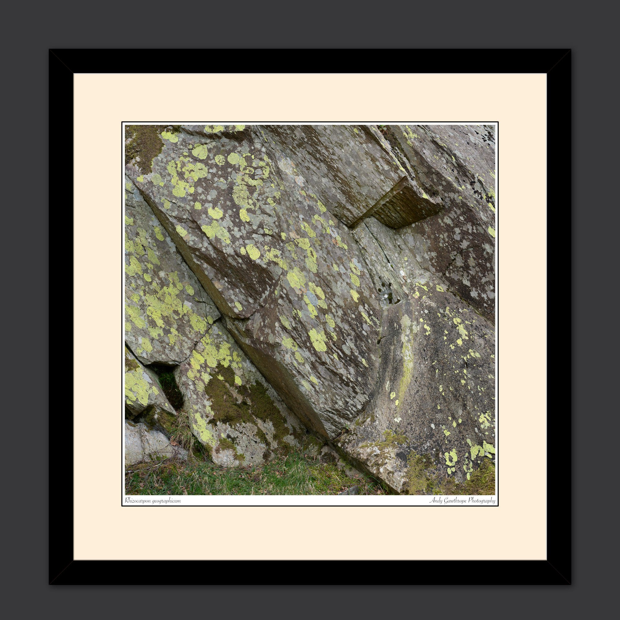
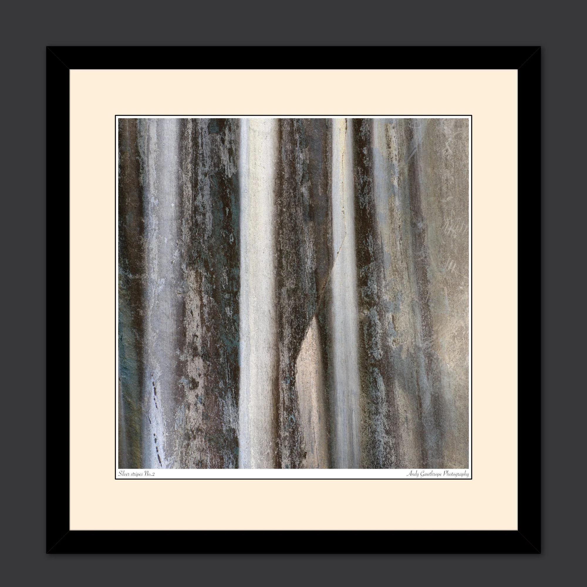
At the risk of upsetting many geologists, I suggest rock is commonly considered as dull and almost uniformly grey! What this project shows is that rock can be many different colours depending on its mineral composition and is certainly not a boring uniform grey! Some of my favourite images from the project are the parallel, vertical silver stripes. Not only are they a bold pattern but they are very simple with lots of detail and the square composition adds that little extra tension. I like the questions that come to mind. Just what are those stripes and where do they go? What am I looking at? I also like those with blocks of orange, pink, black and brown colours. Again I'm drawn to the images and forced to question what I see. These are the abstract images. With other images the subject is clear, such as the tiny green fern growing in a pocket on an otherwise clean, grey rock-wall. It's so incongruous that I instantly knew it had to be in a photograph. For that and a few others, I felt context was important and chose to include a greater amount of rock.
Conclusion
This project deliberately constrained itself to a few places in Borrowdale so as to be manageable and not open-ended. But I’m of the mind that it could be extended to other area’s and could grow in coming years. Stylistically it’s been very different and a refreshing change.
Many of the photographs in this post will soon be available as individual prints or sets of prints on the Andy Gawthrope Photography website.
I do hope you've enjoyed reading this and seeing the images from the project. Please leave a comment below.
All images are copyright Andy Gawthrope Photography.